

Making It Work ...
16th April, 2018 by Geoff
I walked into my local doctor’s surgery and noticed they had set up a competition with the local primary school to design a ‘logo’ for the health centre. My heart sank. So much for our profession that people think that anyone can design an effective identity; it must seem so simple to the outside world - why would anyone need to go to university to do a graphic design degree?
Not wanting to be confronted with some naive image on the walls and getting more depressed every time I visited the surgery, I jumped in and asked to be part of the judging panel.
As you will have expected, the solutions by the school children were appalling, with no clear idea about the needs and requirements of a health centre identity. This was probably exacerbated by a very poor brief… the blind leading the blind. However, there was one solution, only one, that had possibilities. It was not an original idea but one that could work….. as a socially responsible company I volunteered Spoken Image to turn the felt tip drawing into something that would do a job.
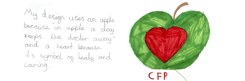
The visual that won the competition was a red heart in the centre of a green apple with the letters CFP underneath.
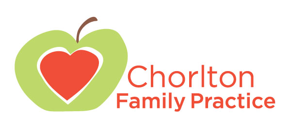
In order to make it work we’ve redrawn it, but keeping the form of the original visual. We have also changed the green tone to a fresher and lighter colour, not least because it will then print as a grey on a black and white photocopier and give a differentiation to the red, that would print as a solid black when photocopied. As an added safeguard we have indicated a white border around the heart as green and red are complementary colours and when printed next to one another they may cause a flicker to some viewers. The typography has been repositioned at the side of the logo using the full name and in type sizes and weights to balance the logo. This landscape format will also make it easier to use in a variety of situations from printed leaflets and forms, to posters and signs.
It’s not the greatest identity, but it now does a job in that it looks competent. I now feel a little easier when I visit the docs (which I don’t do very often)….and another bonus, our prize for sorting out the identity…. the doctor’s practice will support ‘Reachout’ our selected charity for disadvantaged children. All a win win!


Making It Work
16th April, 2018 by Geoff
I walked into my local doctor’s surgery and noticed they had set up a competition with the local primary school to design a ‘logo’ for the health centre. My heart sank. So much for our profession that people think that anyone can design an effective identity; it must seem so simple to the outside world - why would anyone need to go to university to do a graphic design degree?
Not wanting to be confronted with some naive image on the walls and getting more depressed every time I visited the surgery, I jumped in and asked to be part of the judging panel.
As you will have expected, the solutions by the school children were appalling, with no clear idea about the needs and requirements of a health centre identity. This was probably exacerbated by a very poor brief… the blind leading the blind. However, there was one solution, only one, that had possibilities. It was not an original idea but one that could work….. as a socially responsible company I volunteered Spoken Image to turn the felt tip drawing into something that would do a job.
The visual that won the competition was a red heart in the centre of a green apple with the letters CFP underneath.
In order to make it work we’ve redrawn it, but keeping the form of the original visual. We have also changed the green tone to a fresher and lighter colour, not least because it will then print as a grey on a black and white photocopier and give a differentiation to the red, that would print as a solid black when photocopied. As an added safeguard we have indicated a white border around the heart as green and red are complementary colours and when printed next to one another they may cause a flicker to some viewers. The typography has been repositioned at the side of the logo using the full name and in type sizes and weights to balance the logo. This landscape format will also make it easier to use in a variety of situations from printed leaflets and forms, to posters and signs.
It’s not the greatest identity, but it now does a job in that it looks competent. I now feel a little easier when I visit the docs (which I don’t do very often)….and another bonus, our prize for sorting out the identity…. the doctor’s practice will support ‘Reachout’ our selected charity for disadvantaged children. All a win win!